
The Power of Palette: Redondo Edition
Share
How color shapes the emotional architecture of your space
Color is more than aesthetic—it’s atmosphere. In the Redondo Collection, we chose each hue to evoke a specific emotional response: calm, clarity, and quiet confidence. These aren’t loud colors. They’re layered, nuanced, and deeply intentional. They support spaces that feel open, grounded, and expressive without excess.
Let’s explore the psychology behind each shade—and how it contributes to the Redondo vibe.
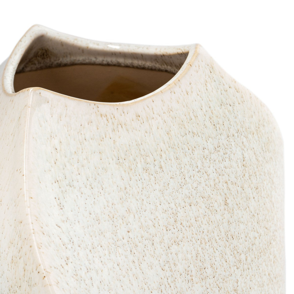
Soft Sand
Warm, neutral, and sunlit—Soft Sand evokes the feeling of coastal stone and bleached wood. It’s a grounding tone that adds warmth without heaviness. In interiors, it creates a sense of ease and openness, making it ideal for entryways, living rooms, and transitional spaces.
Ocean Grey
Cool and structured, Ocean Grey brings urban edge to the palette. It’s the color of concrete, mist, and quiet mornings. Psychologically, grey promotes focus and clarity. In Redondo, it anchors the softer tones and adds architectural depth—perfect for workspaces or minimalist styling.
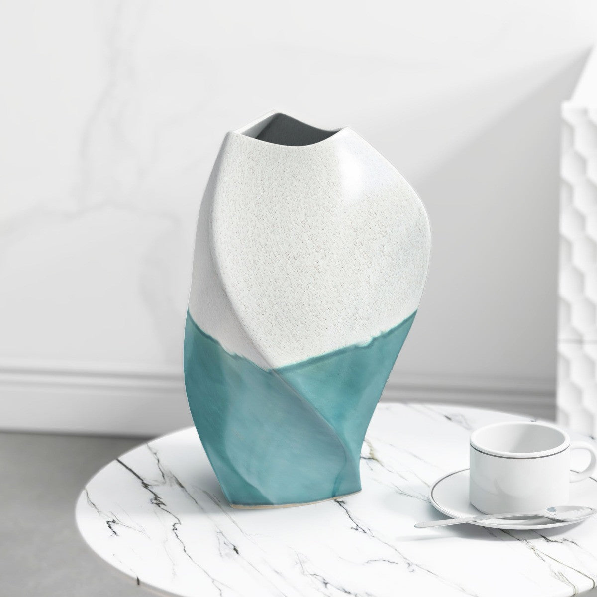
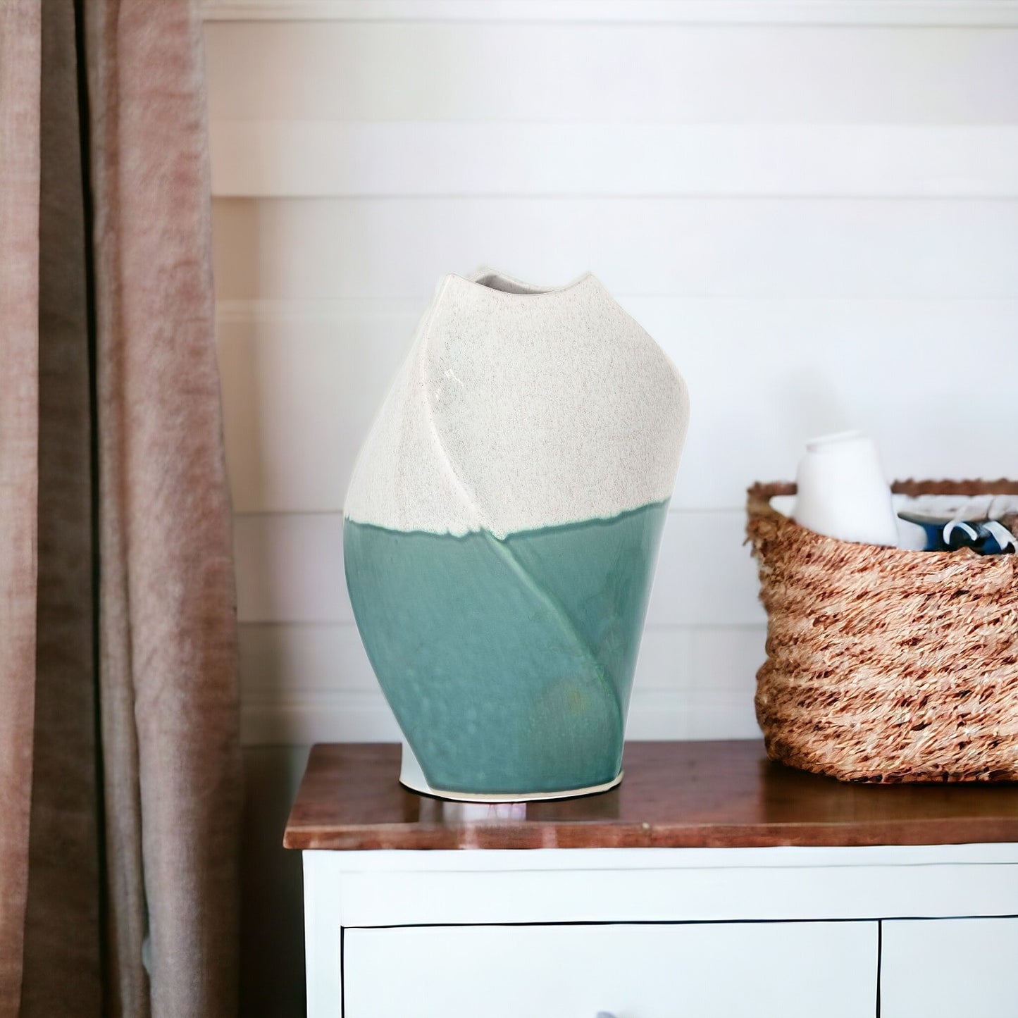
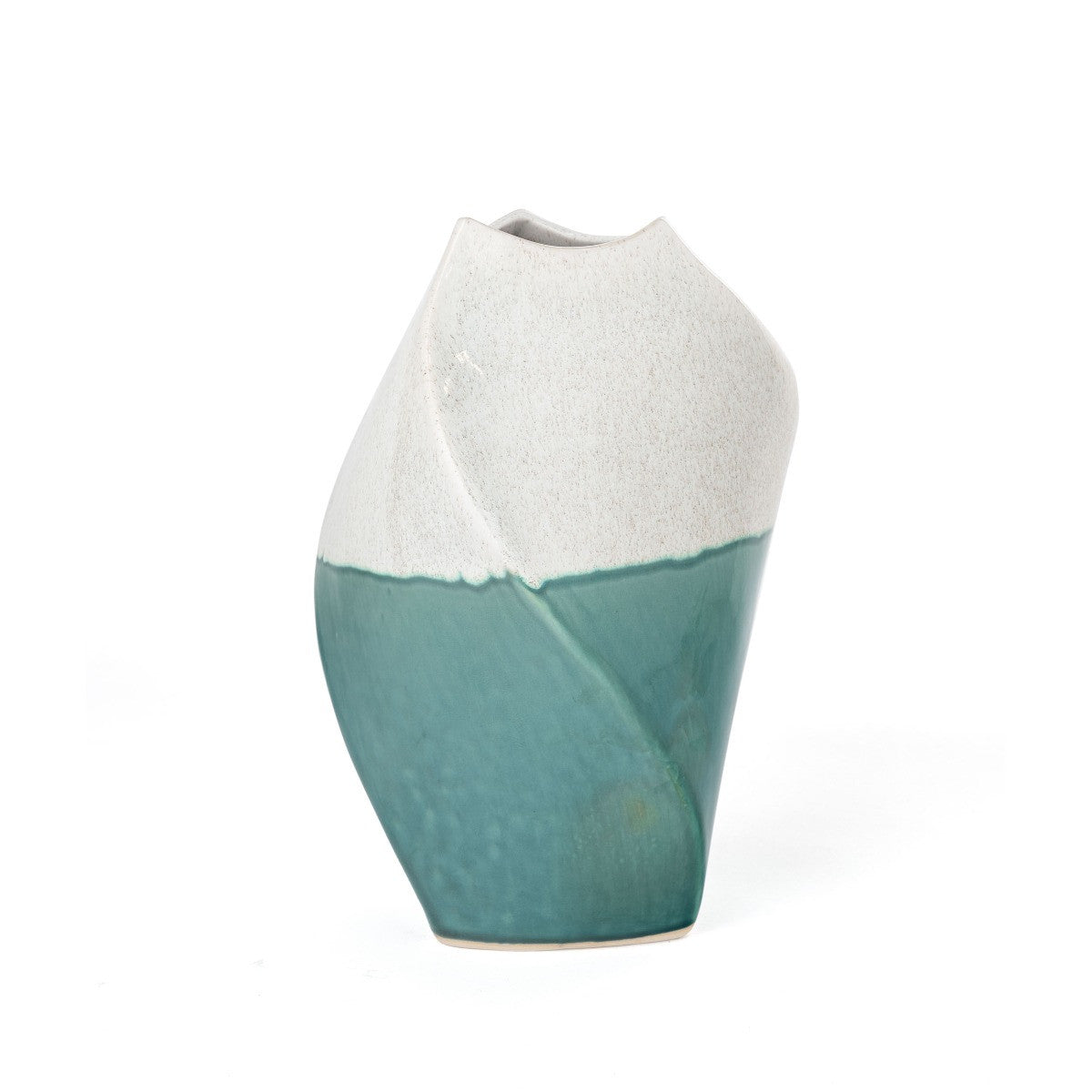
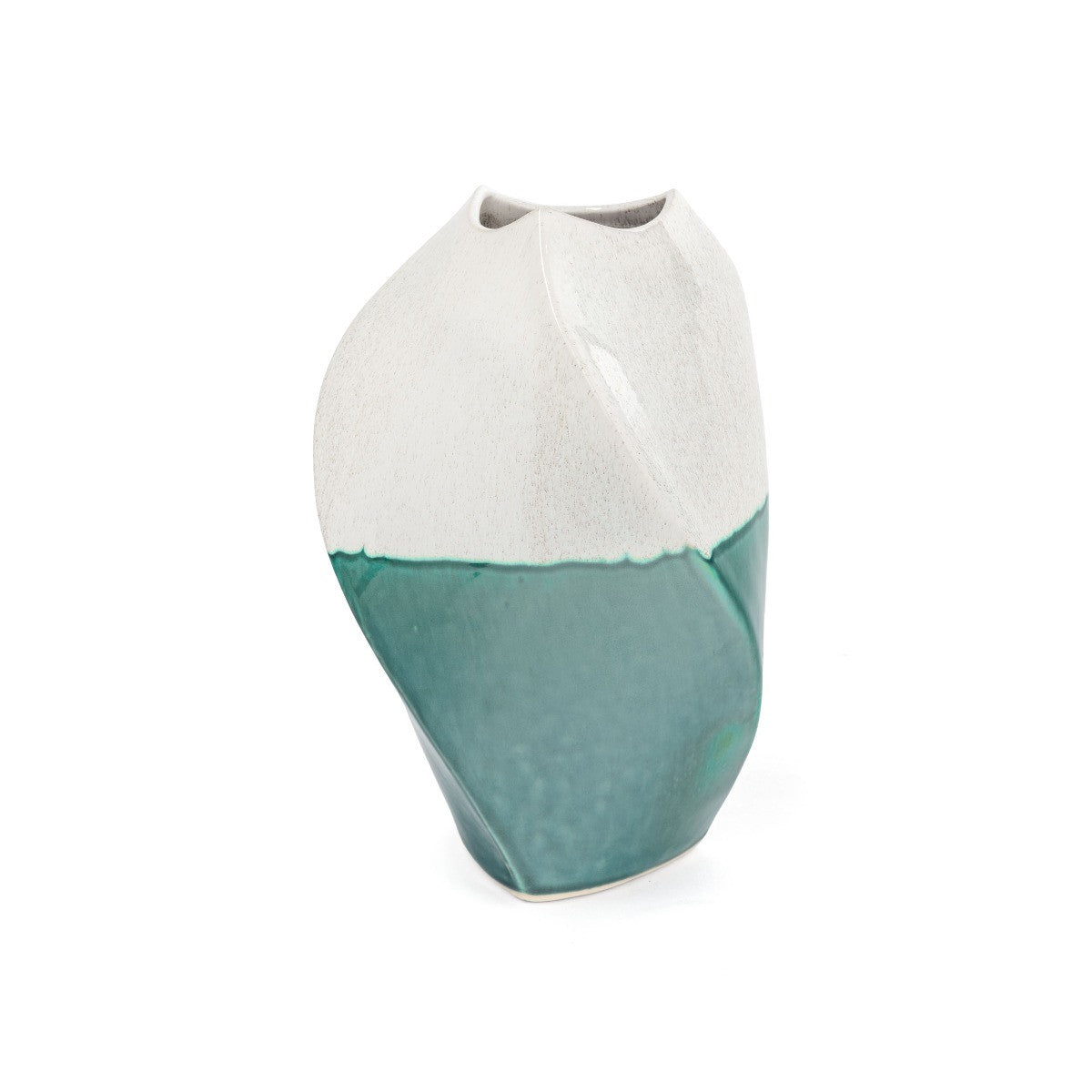
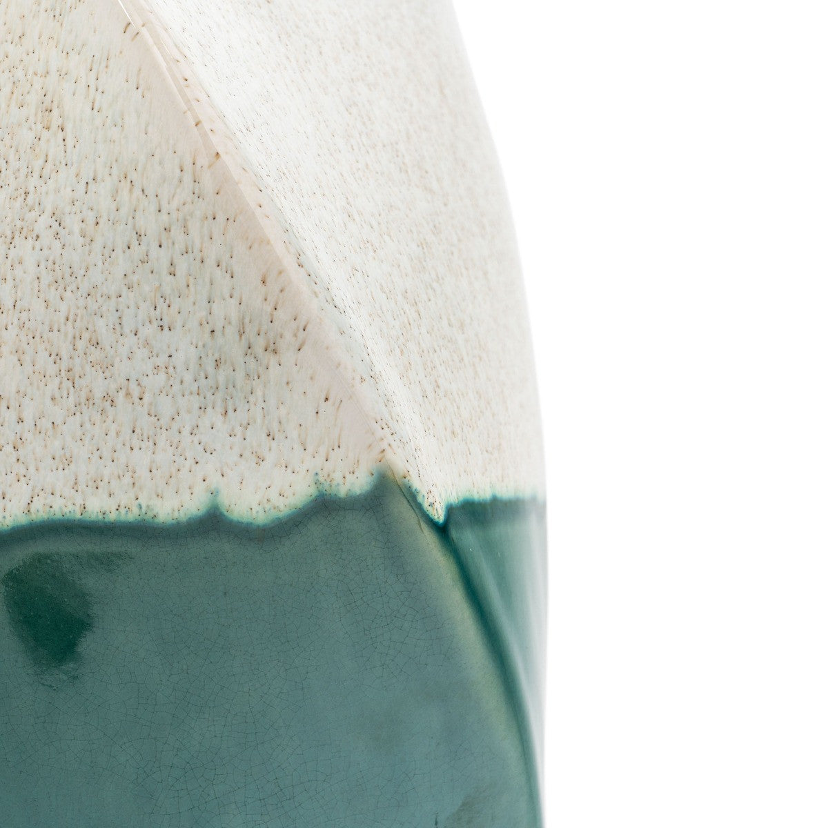
Mist Blue
Airy and reflective, Mist Blue captures the lightness of coastal skies. It’s a color that invites breath and flow. Used in textiles, ceramics, or wall accents, it adds a sense of movement and emotional spaciousness. Mist Blue is ideal for bedrooms, reading nooks, or anywhere you want to feel calm.
Clay
Earthy and muted, Clay adds depth to the palette. It’s the quiet strength beneath the softness—a tone that evokes handcrafted materials and natural textures. Clay works beautifully in layered styling, especially when paired with linen, wood, or brushed metal.
Styling with Redondo’s Palette
Together, these colors create a visual rhythm that’s both serene and expressive. Soft Sand and Mist Blue bring lightness. Ocean Grey and Clay add structure. The result is a palette that supports emotional clarity and aesthetic flow.
When styling with Redondo, think in layers. Use tone-on-tone combinations, mix matte and gloss finishes, and let each color breathe. These shades aren’t meant to shout—they’re meant to speak softly, with intention.